Site Overlay
atavistmas-1605755842-33.jpg

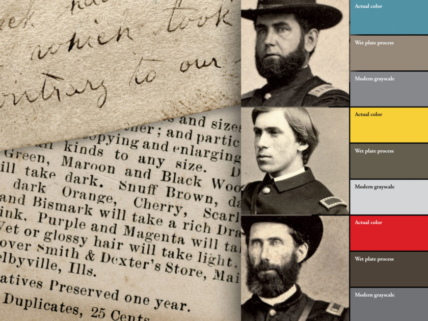
When Yellow Is Black and Blue Is White: Understanding color within the confines of the wet plate process

By Elizabeth A. Topping 

We tend to view 19th century photographs with a modern eye when interpreting color. Today’s digital algorithms and film depicts tones of color in a fairly accurate way. We must consider many variables when determining color in wet plate photography, such as light, shadow and the chemicals themselves to aid us in discovering the true colors.

First and foremost, however, we must remember that the wet plate process was sensitive only to blue light.

  • Warm colors, those favoring red, such as orange, green and some yellows, may appear as black in the finished image. Blonde and red hair, freckles and tanned skin appear dark gray or black. Is the lady wearing a morning dress or one made of yellow changeable silk, a high gloss material that reflects light?
  • Cool colors, those favoring blue, such as sky blue, violet and lavender, appear white. Blue eyes and fair skin seem to be white in period images and are sometimes, mistakenly, attributed as post-mortem images.
  • White may appear as white or gray. Black wool will appear as gray, yet gray wool (being a cooler shade) may appear as white.

As you can see, it can be a challenge to ascertain colors accurately in period images.

The intersection of science and art

An article in an 1860 issue of The Photographic News explained this phenomenon resulting from the interaction of chemicals and light: “The chemical action of white light is proportional to its luminous intensity; but the same cannot be said of coloured light. The most luminous or brilliant colours have hardly any photographic action, whilst those less brilliant are extremely active. Hence, the red, orange, and yellow rays make little or no impression upon the sensitive plate; whilst the blue, indigo, violet, and invisible rays of the spectrum act upon this plate instantaneously. In other words, the three most brilliant colours of the artist’s palette are in photography, on the contrary, the three obscure tints, and reciprocally, the three dark tints of the painter are the most brilliant colours of the photographer.”

Amanda H. Armstrong pictured in black and white, top, and after the addition of color by a artist in Brady’s studio. Carte de visite by Mathew B. Brady of Washington, D.C., and New York City. Elizabeth A. Topping Collection.
Amanda H. Armstrong pictured in black and white, top, and after the addition of color by an artist in Brady’s studio. Carte de visite by Mathew B. Brady of Washington, D.C., and New York City. Elizabeth A. Topping Collection.

The strength of the chemical used by the photographer when developing prints could have an effect on color representation. A strong developer brought out detail in the halftones and in the shadows of the original plate. A weak developer brought out details in the highlights.

Another Photographic News article stated if a photographer typically used “a ten grain solution of iron, pretty well acidified” and the sitter is “a lady with a clear, white complexion, dark hair, and deep-set dark eyes” this strength of developer intensified this face of “strong actinic contrasts” and created a harsh, exaggerated effect. “Such a face would be best brought out by a strong developer and a rapid development.” However, if the subject had “yellow hair, reddish complexion, and light eyes” the lack of actinic contrasts was best enhanced by a “weak developer, plenty of restraining acid, and a slow development” to ensure a sufficient amount of contrast in the photograph.

Considering complexion in connection with clothing

The armies and navies during the Civil War were overwhelmingly composed of volunteer soldiers and sailors that knew little of military culture other than local militias, many of which were of a fraternal nature. Moreover, photographers had little experience capturing the likenesses of military men. Many camera lensmen did not practice their craft when the previous war against Mexico had occurred some 15 years earlier. It is fair to state that photographers and citizen soldiers in 1861 adapted what they had experienced in the peacetime world and applied it to a nation at war.

Advice about clothing selection includes this from The Photographic News: “The style of dress, to be best suited to portraiture, should be governed by rules wholly different from those which apply to the toilette in its ordinary uses. In photography, there is no question whether this or that colour best suits the complexion…when the actinic contrasts in the face, eyes, and hair are strong, considerable contrast in the dress is allowable and may be even advantageous. Or, if the colour of the dress is to be uniform, a dark colour is advisable. On the other hand, when there is want of contrast in the face, strong contrasts in the dress must be wholly prescribed. And if it is preferred to use a dress of uniform colour, a light shade is preferable.” If these rules were not followed, the photographer would find himself over or underdeveloping the face.

Members of the 53rd New York Infantry, also known as the D’Epineuil Zouaves, wore red fezzes with bright yellow tassels. The color and material of the tassel displays as black in wet plate photographs. Carte de visite by Robert Newell of Philadelphia, Pa. Ronald S. Coddington Collection.

As mentioned above, fabric choice determined how colors appeared. Silk goods usually produced a lighter shade than wool of the same color. “The material of the garment plays a very important part…the gloss, the color, and the thickness of the material [can influence the color], or the high lights produce ugly white spots,” observed Dr. Hermann Vogel in his 1871 Handbook of the Practice and Art of Photography.

Robert Hunt’s 1853 Manual of Photography advised that clothing not be made up of tints that strongly contrasted such as wide stripes of varying colors. “Different parts of the dress…require intervals, differing considerably, to be fairly copied; the white parts of a costume passing on to solarization before the yellow or black tints have made any decisive representation.”

The Photographic News noted potential conflicts between clothing choices and skin tone:

“If the model possesses a brilliant complexion, a red or rosy tint, and, at the same time, be dressed in dark colours, it will be difficult, if not impossible, to obtain satisfactory results. The face will, in all probability, be completely solarised before the dress is well sketched in. To insure a harmony of tones with a pure white face, the dress must be, as much as possible, composed of photogenic colours. We must not only pay attention to the colour of the stuffs, but also to their nature. Thus, the face, however brilliant in colour, may yet succeed tolerably if the person’s dress is of glossy silk, though of an anti-photogenic colour.”

Hair was also a factor. Persons with light hair were advised by photographers to wear light clothing, while those with dark hair to wear darker clothing. This was to avoid the face being over or underexposed. “Whenever the photographer is consulted by a female sitter as to the best costume, he should counsel black. A glossy black silk dress displays a beautiful arrangement of light and shade in the photograph; by which an effect of light grey is obtained – much preferable to opaque white,” stated The Photographic News.

Ladies’ magazines sometimes advised their readers how to dress for a photograph. In 1865, Godey’s Lady Magazine pirated this advice directly from The Photographic News: “A lady or gentleman, having made up her or his mind to be photographed, naturally considers… how to be dressed so as to show off to the best advantage. This is by no means such an unimportant matter as many might imagine. Let me offer a few words of advice touching dress. Orange colour, for certain optical reasons, is, photographically, black. Blue is white; other shades, or tones of colour are proportionally darker or lighter, as they contain more or less of these colours. The progressive scale of photographic colour commences with the lightest. The order stands thus: white, light-blue, violet, pink, mauve, dark-blue, lemon, blue-green, leather-brown, drab, cerise, magenta, yellow-green, dark-brown, purple, red, amber, morone [maroon], orange, dead-black.

HELPFUL HINTS: The back of the mount of this carte de visite includes practical tips for gallery visitors to make the most of their picture-taking experience. Carte de visite by G.W. Sittler of Shelbyville, Ill. Rick Brown Collection of American Photography.

The advice continued, “Complexion has to be much considered in connection with dress. Blondes can wear much lighter colours than brunettes: the latter always present better pictures in dark dresses, but neither look well in positive white. Violent contrasts should be especially guarded against. In photography, brunettes possess a great advantage over their fairer sisters. The lovely golden tresses lose all their transparent brilliancy, and are represented black; whilst the ‘bonnie blue eye’ theme of rapture to the poet, is misery to the photographer, for it is put entirely out. The simplest and most effective way of removing the yellow colour from the hair is to powder it nearly white; it is thus brought to almost the same photographic tint as in nature. The same rule, of course, applies to complexions. A freckle quite invisible at a short distance is, on account of its yellow colour, rendered most painfully distinct when photographed. The puff-box must be called in to the assistance ofart.”

The Civil War soldier or sailor, clothed in a prescribed uniform of various materials, had limited options compared to their civilian counterparts. But they did have control over how to wear it. For example, unbuttoning a frock coat to reveal a shirt, vest and tie could act as a buffer between blue wool and a dark complexion. The decision to reveal underclothing, or perhaps to wear a light-blue greatcoat or a cap, might have been influenced by the knowledgeable photographic artist seeking to play to the sitter’s strengths.

Color study: Shoulder straps

INFANTRY

CAVALRY

ARTILLERY

Backdrops and skylights

Photographers used differently shaded backdrops, single tone and painted, in the studio to compliment the complexion of their sitter, such as a very dark grey for fair and light-haired people, the elderly or ladies wearing a white cap or bonnet.

T.S. Arthur’s 1850 volume, Sketches of Life and Character, suggested sitters prepare for the studio. “As a general rule, it is advisable to adopt dark-coloured clothes; silk and satin gowns give very fine reflections of light, and the Scotch plaid especially will be reproduced with such variegated tints as to represent in some sort their colours… while light-coloured or white clothes [will] make the face appear darker, by contrast, then it is in reality.”

The type of lighting also influenced the perception of color. In this era before flash photography, natural light from windows and skylights filled the void. Photographers sometimes covered their skylight in blue tissue to balance the harsh yellow of daylight and have better control over their exposure times. “The top-light acts with the greatest chemical intensity; hair and forehead are unusually bright with the light, while the shadows are very deep,” explained Vogel’s Handbook. “This demonstrates that with the aid of illumination we can modify to a considerable degree the color of hair, background, and clothing.”

During the Civil War the same rules applied and could be controlled inside the gallery. Camp photographers did not enjoy the same benefits. They had fewer options, traveling with limited supplies and a tent or outbuilding to set up shop. The best of these itinerants were likely well versed in the techniques of their craft and able to improvise in less than optimal conditions.

The photographer’s eye

To bring together the complexities of color, texture, chemical and light in a monochromatic environment, a trained photographic artist was essential. Vogel’s Handbook explained the challenge through the lens light: “The cold colors (blue) are reproduced too light, while the warm colors (yellow and red) rendered too dark. This contrast has to be equalized if the picture is to be true… we have to ignore the color and observe what should be light, half shadow, and dark.”

Therefore, the skilled photographer adjusted his chemicals and/or lighting to correct color imbalances, thereby rendering difficult colors more closely to their actual tone.

UNEXPECTED RESULT: An observation written on the back of the mount of this carte de visite states, “Beck had a purple dress on which took light contrary to our expectation.” The writer may have been the owner of the carte. Carte de visite by S.B. Moore of Wabash, Ind. Rick Brown Collection of American Photography.

Alfred H. Wall in his 1861 Manual of Artistic Colouring articulated the danger of not mastering the craft. “Suppose, for instance, a lady wearing a dark green or black dress is seated upon a crimson-velvet chair, by a table covered with a red cloth, and before a dark background, in the usual subdued light. On the ground-glass all may appear right – the darks merging softly into the lights, and vise-versa–but in your photograph what will be the result? Why, there will be three white isolated spots, formed by the hands and ghastly white face, staring out from a dense black mass which has swallowed up all the details of the dress, figure, chair, table and background.”

Unlike period paintings, photography was considered an unbiased representation of reality, despite its limitations in accurately capturing color. A knowledge of who wore what and why, coupled with an understanding of the reaction of chemicals and light in wet plate photography, can enhance our determination of the true colors within the period image we hold in our hands.

References: The Photographic News, April 16, April 20, June 15, 1860, Dec. 2, 1864, Oct. 27, 1865; Vogel, Handbook of the Practice and Art of Photography; Hunt, A Manual of Photography; Arthur, Arthur’s Sketches of Life and Character; Lerebours, A Treatise on Photography; Wall, Manual of Artistic Colouring.

Elizabeth Topping has been a reenactor and living historian for more than 25 years. Her collection and research focuses on the social and material history of the Civil War years. Her initial study centered on the subject of prostitution, which ultimately led to research on abortion, birth control and childbirth, female job opportunities and working conditions, medical treatment for poor and insane women, class and sex restrictions imposed on 19th-century females, the roles actresses played in society, and the parts women played in aiding the war efforts. Elizabeth enjoys sharing her expertise and artifacts for use in television programs, museums, magazines, conferences and roundtables.


SPREAD THE WORD: We encourage you to share this story on social media and elsewhere to educate and raise awareness. If you wish to use any image on this page for another purpose, please request permission.

LEARN MORE about Military Images, America’s only magazine dedicated to showcasing, interpreting and preserving Civil War portrait photography.

VISIT OUR STORE to subscribe, renew a subscription, and more.

Scroll Up